DEANNA HARP
My photography experience extends to several student series and study abroad. I have also had my photos included in Valley Bride Wedding Guide and Jmore Magazine in connection to Santoni’s. I am currently focused mainly on food photography; a great deal of which can be viewed here.
I worked for Santoni’s Marketplace & Catering as their Marketing Coordinator and Graphic Designer. I originally started in this position as the Graphic Designer and Marketing Assistant, but having took on more responsibilities and expanded my role, I was promoted after a year. My responsibilities included the visual presentation of the Marketplace, building and maintaining the photography library by conducting photo shoots and going on site to catered events, designing custom event and seasonal menus for catering packages, management of Santoni’s social media accounts, the design of advertisements, weekly maintenance of the WordPress website and creation of Constant Contact emails, and marketing for both the Catering business and the Marketplace. I also oversaw the Marketing Internship Program, working directly with the interns to help them produce quality work which would be used in the Marketplace and on social media, that also adhered to the Santoni’s Brand Style Guide, which I wrote.
Barbara’s Biscotti’s was a 2015 student branding project which I created for my mother, who had taken to making biscotti from scratch. She would often give them as gifts to friends and family in plastic freezer bags. I thought her hard work deserved a better presentation. So I bought her some ribbon and individual plastic bags, and made her several custom stickers to label them with.
I designed the Confirmation 2019 retreat tee shirt for St. Peter’s Catholic Church in Libertytown, MD. The concept presented to me was for the gifts of the Holy Spirit to be listed in a flame design. I took that direction and created a typographic design with a rugged feel so that teens would not only like the design, but want to wear it after the retreat was over.
This poster series explores the question "What is love?" and was originally created for Stevenson University's 2016 Senior Exhibition, "Questions" I crafted miniature wire sculptures to symbolically represent different forms of love. I then photographed and edited them, incorporating color and typography to better illustrate the message of each piece. I also ran an Instagram account for the project hoping to get the student body to engage in the concept presented by the series.
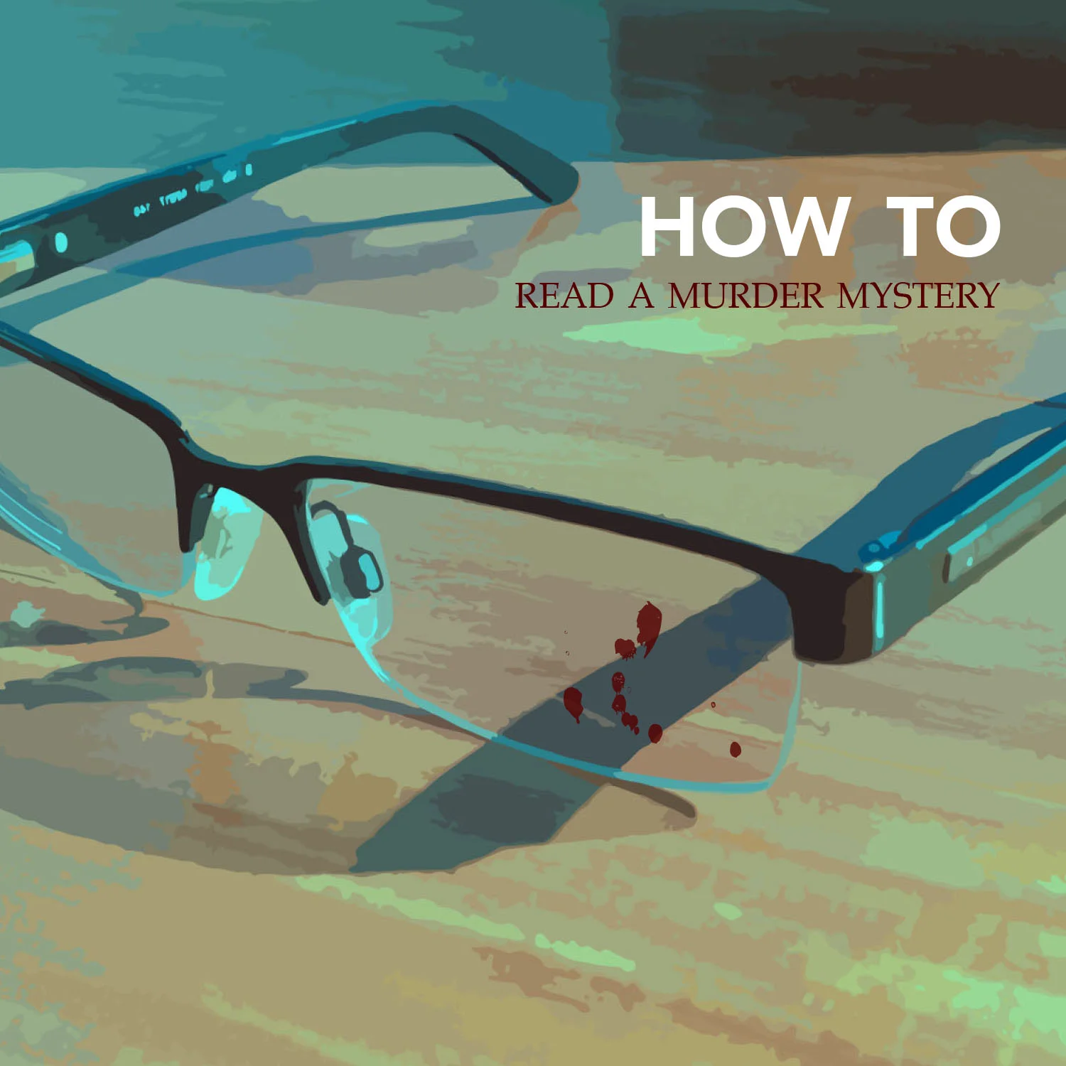
This was a 2015 student project that encouraged students to experiment with typography by creating a “How To” instructional book. As a child who would read Nancy Drew under the covers with a flashlight, I decided to detail my ideal conditions for reading a murder mystery, with a goal of getting the reader as excited about the experience as I was.
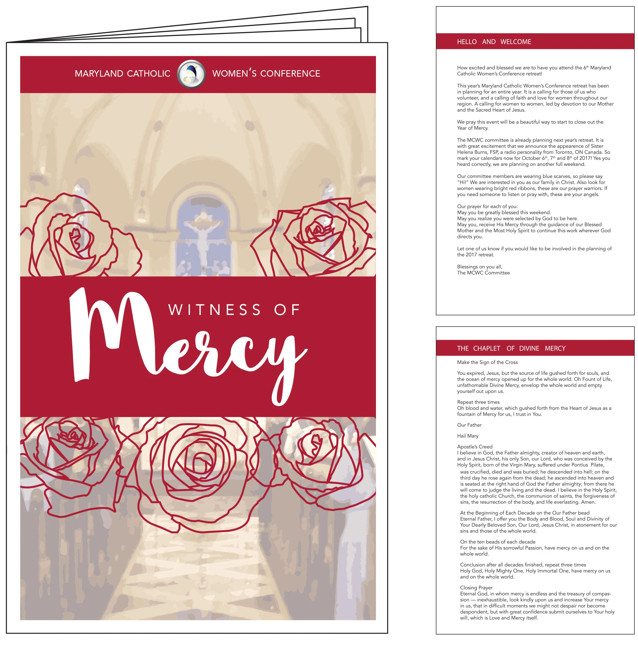
The theme for the 2016 Maryland Catholic Women's Conference was, “Witness of Mercy” The materials I designed included a brochure, flyer, and program.
I chose to employ a bold shade of red in the designs because the word “mercy” is often associated with that color. I also chose to pair a calligraphic script and sans serif font because I believed it would most attract our target audience, which was women who were eighteen years or older. I also used a photograph supplied to me of the venue, The Immaculate Conception Chapel at Mount St Mary’s University in Emmitsburg, MD, on the front of the brochure and the program, so that women who had not been to the venue before, would know they were in the correct location.
The theme for the 2017 Maryland Catholic Women’s Conference was, “Fire Within” I created a calligraphic script based typographic illustration to appeal to not just to women, but to younger women, since that was the specific audience the conference wanted to focus on growing. I was supplied with the background image, which was taken at the conference venue, The Immaculate Conception Chapel at Mount St Mary’s University in Emmitsburg, MD. I pulled other colors from the photograph to build a color palette used in both the flyer and program.
The theme for the 2018 Maryland Catholic Women’s Conference was “Fearless” inspired by St. Catherine of Siena. In researching St. Catherine, I came upon a sculpture of her in Rome which I used as inspiration to create a digital painting in Photoshop. This was my first attempt at a digital painting and it was used on printed flyers as well as social media posts, cover photos and advertisements.
In May of 2019, I was asked to submit a logo and branding identity design for the newly formed Pregnancy Support Center of Carroll County. I generated multiple logos, as well as a business card and letterhead design.
The Northeast Regionals Honors Council was holding their annual student conference and posed a design challenge to Stevenson University seniors to design their conference program. We were universally guided by our professor to reconfigure the program into a folder, so that students would have a place to store papers they would gather throughout the conference. Other requirements dictated that the conference schedule, a map, and the NRHC logo be included on the folder. The theme of the conference was “Migrations” and it was to be hosted in Cambridge, MA.
I chose to represent the theme through geese, who are common to the region where the conference was to be held, and are known for migrating south in the winter and north in the summer. I then took the concept a step further by presenting the geese in a very abstract form. This was because a migration is a journey, and all of our journeys look different. When it came time for the board to vote on designs, mine was chosen and used for the 2016 conference.
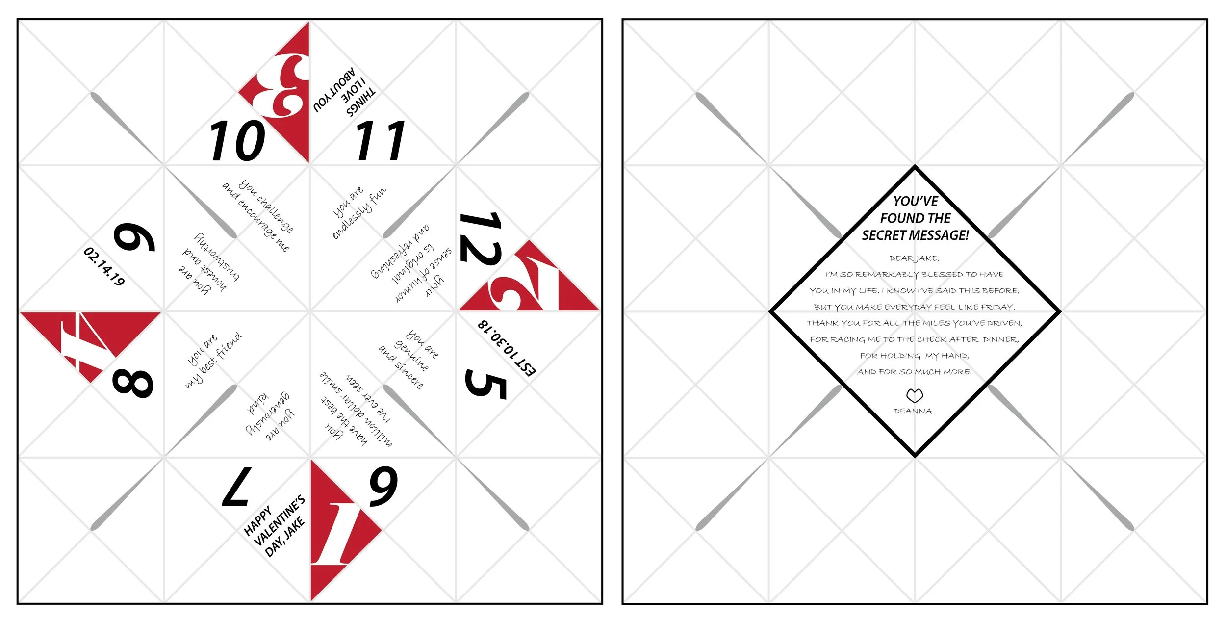
I can’t remember her name now, but when I was in college I learned about a designer who created a series of Valentine’s Day hearts. Her series came back to me from the recesses of my memory as I wondered what I could possibly give my boyfriend for Valentine’s Day, that would also carry some personal meaning.
My thought process took me from a formal letter, to a series of small notes in an origami box, and finally to a fortune teller, which I was taught how to fold in school when I was a kid to help me learn French.
With the reveal of each inside panel, he would be able to discover something I loved about him. Further more, if he unfolded the piece in its entirety, he would discover a secret message, which was another personal note.
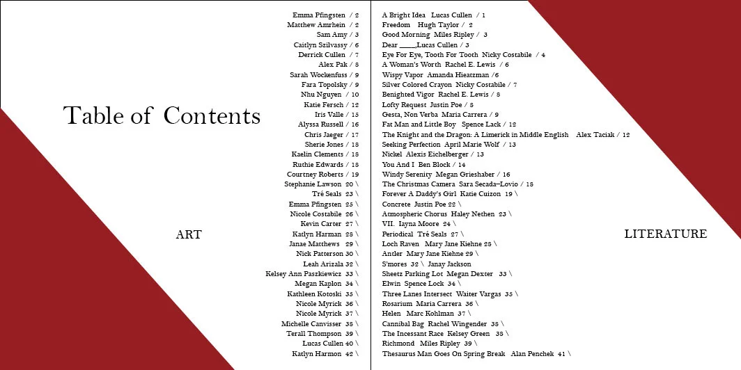
Stevenson University's Art and Literature magazine, Spectrum, invited design students to compete for the cover and layout design of the publication. I chose to pursue the concept of “reflections” which described much of the work included in the publication, and was illustrated through framed layouts. The cover was comprised of multiple mediums including photography and acrylic paint. The design was awarded 2nd place.
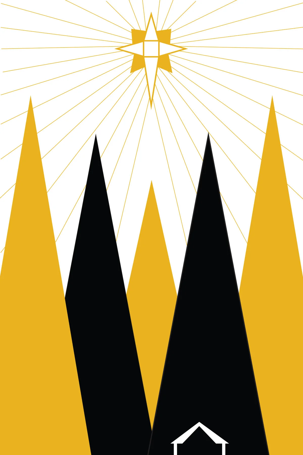
This 2014 student project challenged me to illustrate a series of greeting cards with minimal colors and shapes, that would still exude a holiday vibe.
Gen - Y is a Catholic young adult group based in Maryland that began in August 2016. The concept around this design is based around electricity. I chose that theme because one of the group's main purposes was to create "connections" between Catholic young adults and allow the Spirit of God to "flow through" the new relationships. Electricity is also not often physically seen, but the effects it has are. I created multiple calendars and logos, as well as promotional items like business cards and frisbees.
2014 Student web projects including building websites for a preexisting or imaginary venue, and a site that could benefit the community.
For the first project, I chose to use The Tillie Pierce House Inn, located in Gettysburg, PA as my venue, which I not only built the site for, but rebranded. The Inn, just like several spots in Gettysburg, is famed for being haunted by Civil War era ghosts. The Inn caught my attention because it claims to be haunted by a cat, which is what I modeled the typographic logo from.
For the second project I created a concept site that would be more effective at locating and reuniting lost dogs with their owners than just repeatedly posting on community social network groups. The idea behind this site being that it could be expanded for different regions and include other pets as well.